Importance of Responsive Design in Next.js Apps
With the ever-evolving landscape of web development, creating applications that perform seamlessly across multiple devices is no longer optional but a necessity. As users access content from an array of devices like smartphones, tablets, laptops, and desktops, the need for responsive design becomes imperative. This is especially true in applications built using Next.js, a React framework that offers various features and optimizations out of the box. In this blog post, we will explore the significance of responsive design in Next.js applications and how you can efficiently implement it to enhance user experience.
What is Responsive Design?
Responsive design is an approach that ensures web applications adapt smoothly to various screen sizes and resolutions. This is achieved through fluid grids, flexible images, and CSS media queries that automatically adjust layout and design elements. The primary goal of responsive design is to provide users with an optimal viewing experience—easy navigation, readability, and interaction—regardless of the device they're using.
Why is Responsive Design Important in Next.js?
1. Enhanced User Experience
The primary goal of any web application is to deliver a great user experience. Users expect a seamless interaction with an app, irrespective of whether they're on a mobile phone or a larger desktop screen. Next.js, being a powerful framework built on top of React, allows developers to create applications that can respond appropriately to device size.
By implementing responsive design, you ensure that users can easily read text, click on buttons, and navigate your application without the need for excessive zooming or horizontal scrolling. Improved user experiences lead to higher user satisfaction and retention rates.
2. Better Performance and SEO Benefits
Search engine optimization (SEO) and performance are closely linked to design responsiveness. Google prefers mobile-friendly sites and actively penalizes those that fail to deliver a good experience on mobile devices.
Next.js offers server-side rendering (SSR) and static site generation (SSG), which means that your content can be served to users faster and more efficiently. When your Next.js app is responsive, not only does the performance improve, but you also significantly increase your chances of ranking higher in search engine results.
3. Maintaining Consistency Across Devices
Creating a consistent user experience across different devices can be challenging. Responsive design in Next.js helps maintain a uniform layout, functionality, and aesthetics, ensuring that users enjoy a cohesive experience whether they’re using a phone, tablet, or desktop.
Through responsive design, developers can manage breakpoints effectively, making transitions between different screen sizes smooth. This consistent experience not only strengthens brand identity but also builds user trust.
4. Cost-Effectiveness and Long-Term Viability
Building separate versions of your application for different devices can be time-consuming and cost-prohibitive. With responsive design in a Next.js app, you can save significant resources by developing one application that caters to all devices. This unified codebase ensures easier maintenance and updates, providing long-term viability to your application.
Additionally, in an age where new devices and screen sizes continue to emerge, a responsive design enables your application to adapt without significant code changes. This flexibility is vital for future-proofing your application.
5. Increased Accessibility
Responsive design also plays a pivotal role in web accessibility. A well-designed responsive application takes into account different usage scenarios and diverse user needs, ensuring that everyone can access your content without barriers.
By following responsive design practices in your Next.js app, you can create an application that can be easily navigated by users with disabilities. This commitment to accessibility not only broadens your audience but is also a requirement under various regulations such as the Americans with Disabilities Act (ADA).
Implementing Responsive Design in Next.js Applications
Here are some effective strategies to integrate responsive design into your Next.js applications:
1. Use CSS Frameworks
Utilizing responsive CSS frameworks such as Tailwind CSS, Bootstrap, or Material-UI can significantly speed up development. These frameworks come with pre-defined classes that handle responsive design aspects, allowing you to focus on building your application.
2. Make Use of CSS Media Queries
CSS media queries allow you to apply styles depending on the device's characteristics, such as width, height, or resolution. By creating a fluid layout that adapts based on these queries, you can maintain a visually appealing design across all devices.
@media (max-width: 768px) {
   /* Styles for mobile devices */
   body {
       background-color: lightblue;
   }
}

@media (min-width: 769px) {
   /* Styles for larger screens */
   body {
       background-color: lightgreen;
   }
}
3. Adopt Responsive Images
Responsive images that adapt based on the screen size can improve loading times and overall performance. Use the next/image component provided by Next.js, which automatically handles image optimization and serves the most appropriate image sizes.
4. Flexbox and Grid Layouts
CSS Flexbox and Grid offer powerful layout models that can help you create complex designs with ease. These layout systems allow for dynamic positioning of components that naturally adapt to different screen sizes.
5. Test Across Devices
Testing your application on multiple devices and screen sizes is key to ensuring responsiveness. Tools such as BrowserStack or responsive design mode in browsers can help you simulate different devices.
Conclusion
Incorporating responsive design into your Next.js applications is essential for delivering a high-quality user experience and ensuring your application remains competitive in today’s diverse technological landscape. By focusing on responsiveness, not only will you improve the accessibility and performance of your app, but you will also save precious time and resources in the long run.
As web development continues to advance, making responsive design a priority in your Next.js projects will undoubtedly pay off, resulting in applications that rank higher, perform better, and ultimately, delight users. Remember, a responsive application doesn't just cater to devices—it caters to the journey of every individual user who interacts with your content.
Happy coding!
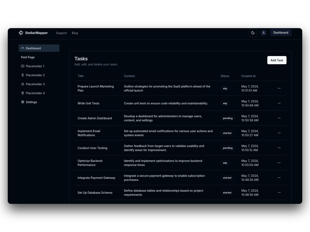
31SaaS
NextJs 14 boilerplate to build sleek and modern SaaS.
Bring your vision to life quickly and efficiently.