Tips for Building a Mobile-Friendly Next.js SaaS
In today's digital landscape, having a mobile-friendly application is no longer a luxury—it's a necessity. With a significant portion of users accessing software services from mobile devices, it’s crucial to ensure that your Software as a Service (SaaS) product is optimized for mobile. Next.js, a popular React framework, provides powerful tools to build robust, performant web applications. In this blog post, we'll explore essential tips for creating a mobile-friendly Next.js SaaS application.
1. Understand Your Audience
Before diving into the technical aspects, the first step is to understand your user base. Conduct research to identify:
- Demographics: What age group uses your application? Are they tech-savvy?
- Device Usage: What devices do they prefer? Smartphones, tablets, or desktops?
- User Preferences: What features do users value most when accessing your service on mobile?
Understanding these factors will help you make informed design and feature decisions tailored to your audience's needs.
2. Prioritize Responsive Design
Responsive design is essential for ensuring that your application looks good and operates efficiently on all screen sizes. Here are some strategies to implement responsive design effectively:
- Fluid Grids: Use relative units like percentages instead of fixed units for widths. This allows elements to resize dynamically based on the screen size.
- Media Queries: Employ CSS media queries to apply different styles depending on the device's screen width.
- Flexible Images and Videos: Ensure images and videos can scale by setting their maximum width to 100%. Use tools like
srcsetfor better image handling.
Example of a Media Query
@media (max-width: 768px) {
  .container {
    padding: 10px;
  }
  .header {
    font-size: 1.5rem;
  }
}
3. Optimize Performance
Mobile users expect fast-loading applications. Performance significantly impacts user experience and retention. Here are some performance optimization techniques that can be applied in Next.js:
- Server-Side Rendering (SSR): Utilize Next.js’s SSR capabilities to serve fully rendered pages on the initial request, reducing the load time for users.
- Static Site Generation (SSG): For pages that do not change frequently, generate HTML at build time which can significantly speed up load times.
- Image Optimization: Use Next.js’s built-in Image component to serve images with responsive sizes and formats (like WebP) that reduce load times.
Implementing Image Optimization
import Image from 'next/image';

const MyComponent = () => (
  <Image
    src="/path/to/image.jpg"
    alt="Description"
    layout="responsive"
    width={720}
    height={480}
  />
);
4. Seamless Navigation
Mobile navigation can be challenging due to limited screen real estate. Simplify navigation by following these tips:
- Use Hamburger Menus: Allow access to your full navigation options without taking up too much space.
- Sticky Navigation: Consider a sticky menu that remains accessible as users scroll.
- Minimize Clicks: Aim for a one-click solution where possible, ensuring users can access essential features swiftly.
5. Touch-Friendly Interfaces
Mobile interfaces should cater to touch interactions. Keep the following in mind:
- Tap Targets: Size buttons and clickable areas to at least 44x44 pixels to accommodate finger taps.
- Spacing: Include sufficient space between interactive elements to prevent accidental clicks.
- Gestures: Implement common gestures (like swipe, pinch, etc.) to enhance usability.
6. Implement Progressive Web App (PWA) Features
By converting your Next.js SaaS application into a Progressive Web App (PWA), you can enhance the mobile experience significantly. Key benefits of PWAs include:
- Offline Capabilities: Users can access your app without an internet connection.
- Home Screen Access: Users can install your app on their mobile devices for quick access.
- Push Notifications: Keep users engaged with timely notifications.
To implement PWA features in your Next.js application, consider using the next-pwa plugin which simplifies PWA integration.
7. Testing on Multiple Devices
Testing is critical in ensuring a consistent experience across devices. Here are some strategies:
- Browser Dev Tools: Use tools like Chrome DevTools to simulate various devices and resolutions.
- Real-Life Devices: Test your application on actual devices for accurate results. Tools like BrowserStack can help in testing across multiple browsers and devices.
- User Testing: Involve real users in testing sessions to gather feedback on usability and performance.
8. Accessibility Matters
Ensure that your next.js SaaS is accessible to all users, including those with disabilities. Implement the following best practices:
- Semantic HTML: Use correct HTML elements (like
<button>for buttons,<nav>for navigation) to improve screen reader compatibility. - Keyboard Navigation: Ensure users can navigate your application using a keyboard alone.
- Color Contrast: Check the color contrast to support users with visual impairments.
Conclusion
Building a mobile-friendly SaaS application with Next.js involves a blend of understanding your audience, prioritizing design, optimizing for performance, and thoroughly testing. By implementing the strategies outlined in this blog post, you can create a user experience that not only attracts users but also keeps them engaged with your service. As technology continues to evolve, stay curious and keep iterating on your mobile-friendly features to meet user expectations.
By adhering to these principles, your Next.js SaaS can stand out in a crowded marketplace, providing both functionality and usability to enhance customer satisfaction. Happy coding!
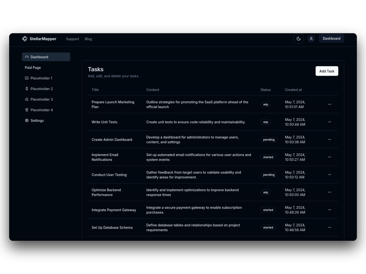
31SaaS
NextJs 14 boilerplate to build sleek and modern SaaS.
Bring your vision to life quickly and efficiently.